80/20 Rule: From Economics to Design
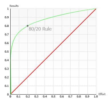
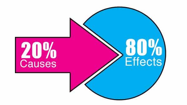
Observing consumer behavior can teach us a lot of information about the features implied within the design and how users will interact with those features. An interesting observation indicated by research is that users do not interact equally with all features offered in a design. When visiting a Facebook profile, only a limited number of features are used on daily basis while others are rarely used. This observation follows the 80/20 rule, also known as the Pareto Principle, which states that in a cause and effect scenario, 80 percent of the effects come from only 20 percent of the causes. The term was originally introduced by the Italian economist Wilfredo Pareto in 1896, and later suggested by management consultant Joseph M. Juran. The 80/20 rule has been observed in many different disciplines, including economics, marketing, and design. In business, many examples can be identified that support this rule, such as:
- 80% of sales come from only 20% of the products
- 80% of tasks achieved occur in 20% of working time
- 80% of a company’s profits comes from 20% of the customers
In the design field, the 80/20 rule contributes to building a better understanding of the system. It focuses effort on the 20% of features or services that will be exploited by 80% of the users. The 80/20 rule can be implemented as a way to prioritize features, services, and elements of the user interface design to improve the user’s experience.
User Experience
User experience aims to provide a user-friendly design and achieving this goal requires designers to build a better understanding about how the user will interact with the product or service. Since current physical and digital products and services provide massive amounts of features to their users, the most commonly used features should be presented to the user first. For example, on Amazon’s website, the features that are most clicked on by users are highlighted and presented at the top of the page when compared to other features that are only viewed by a minority of users. When signing on to the Amazon website, the most selected country options are moved to the top of the country drop-down list. This Amazon example suggests that only 20% of the features are visited by 80% of the website visitors, therefore the user interface layout should reflect these numbers.

Where Do Users Look First?
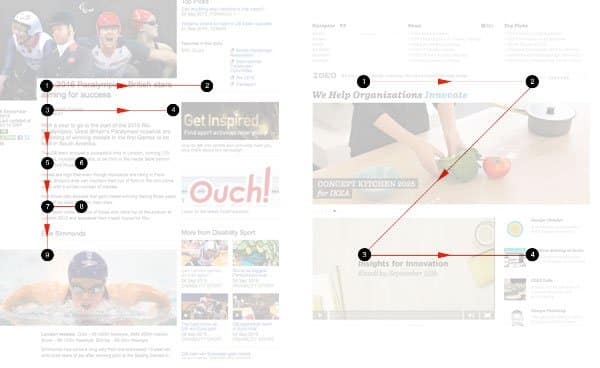
Building a design layout for either digital or print domains require designers to understand how users scan the layout and where they look first. This contributes to organizing the content by placing the most important information in these first scanned sections in the layout hierarchy. Different hierarchies can be applied to the layout based on the type of content and elements found within. Two commonly used hierarchy types are the Z-Pattern and the F-Pattern. The first type is frequently used in layouts with low amounts of text, such as corporate websites, where users scan the page from top left and move in a “Z” shape toward the bottom right. Intensive text layout readers follows the F-Pattern, where users scan the page following an “F” shape from left to right and from top to bottom. Both patterns suggest high priority areas that most of the users’ eyes scan first. Apply the 80/20 rule and consider that the small part of the page is the 20% and it is viewed by 80% of users.

Target audience
As the rule suggests, 80% of a products’ sales are coming from only 20% of their consumers. This leads designers and marketing researchers to identify the top market segment users of the product or service and then design the product to meet with the needs and requirements of this top segment. If the product is targeted towards a multiple segmentation market, then focusing the research and design on the requirement of the top 20% of users may subsequently lead to improving the sales for this selected market niche while keeping the spends allocated to this specific project on a minimum level.
Conclusion
The 80/20 rule is a universal principle the can be implemented in different industries to focus the efforts and resources on the percentage of consumers that drive more sales and profits to the company. The rule can be applied to achieve two goals: to organize the design layout or user interface functions to meet with 80% of the users and to target the 20% of consumers who drive more sales to the company. Examining these different examples indicates that applying the rule can improve the product in a way that drives more profit with less use of resources.


