
In the field of design, controversies between clients and designers sometimes arise regarding the use of “white space,” or negative space between user interface design elements. Misinformed clients are often under the impression that any empty space should be filled in with practical elements. Experienced designers, however, know that white space between typography glyphs, content blocks, or other user interface (UI) design elements adds a stylish look and ultimately enhances user experience. It is essential that we clear up this misunderstanding over such a fundamental design element.
White space can include background images, textures, or patterns between the UI design elements, and it is not necessarily white. Far from being a “waste of space,” white space augments overall elegance by drawing the eyes to other visual elements and organizing design content to tell a story.
Some of the most common places to see negative or white space include:
- The areas around visual elements like logos, photos, typography, images, paragraphs, etc.
- The areas around blocks of content like the margins in a text document or the negative space that separates the left and right sides of a webpage within a browser
- The areas within design elements like white space within typography and glyphs, banners, illustrations, and images - check out Butler Signs for signages services
Related topics:
- Adobe Experience Design CC: Taking the Creative Cloud to Prototyping
- Guerrilla User Experience for Quick, Low-Budget Research
- Five Reasons Behind a Failed UX Design Process
Types of White Space
White space can be classified according to both its size and its function. This classification system has an important effect on user interaction, especially when it comes to interactive designs. Sometimes, white space exists purely for aesthetic purposes. Other times, it serves a specific, intended function.
When categorizing white space, two main questions must be considered. How dense is the white space in relation to the design? And how does it contribute to the design? This distinction between function and layout splits white space into two forms: active white space and passive white space.
Active and Passive
Active white space takes on the role of guiding the user through his or her experience through the product’s design. The user’s eyes are drawn to content based on active white space, and it is used to direct the flow of information, content order, and overall navigation. One example would be line breaks between paragraphs in a text document.
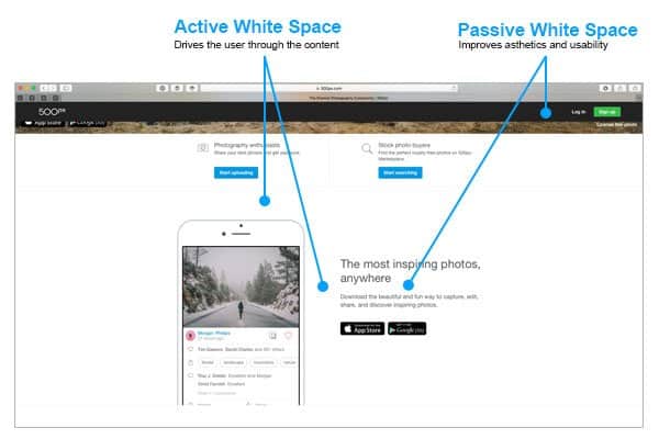
Passive white space, on the other hand, is purely stylistic and exists mainly to improve the look of content. For example, in a text document, passive white space would include the spaces between letters, line spacing, and margins.
In addition to its active and passive forms, white space can also be broken into two main categories based on its size and prevalence within the design. These two categories are micro white space and macro white space.
Micro and Macro
Anytime you see negative space between menu items on a website, lines between paragraphs in text, or the area between graphic elements, it can be defined as micro white space. Simply put, micro white space refers to small areas—but these small areas can have big results. The amount of white space between words, paragraphs, and margins has been shown to significantly affect comprehension and reading speed.
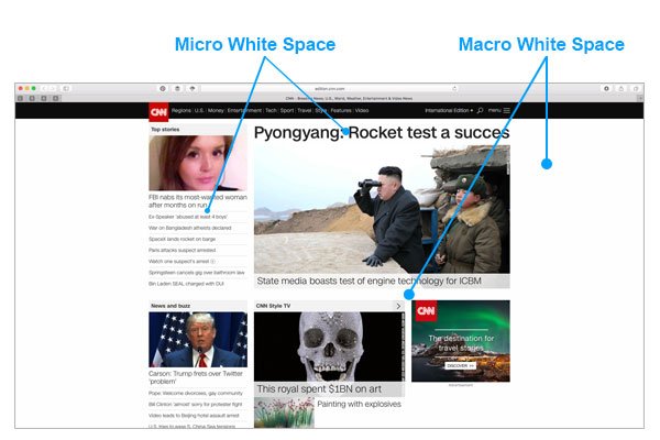
The area within and surrounding design elements is oven considered macro white space, and, as you may have guessed, these areas tend to be large. Think of macro white space as the background—the vessel that contains design elements within it. The role of macro white space in user interface is especially noticeable on websites where it separates content blocks to aid in site navigation.
The Functions of White Space
The white space can be adopted to archive visual goals in the UI design, these goals vary depending on the project and the user interface type as following:
Branding
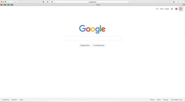
You’ll notice that text-heavy news websites often feature very little macro white space. This conveys a message of being straightforward and informative. On the other hand, sites that advertise a product or a brand often utilize large amounts of macro white space as a means of communicating minimalism and simplicity—even elegance or luxury.

Companies such as Mercedes-Benz, IKEA, and Apple use lots of macro white space to imply the superiority of their products. Excess white space has even been theorized to convey a brand’s excessive budget. In any case, much can be said about the tone and feel of a brand’s message based on the amount of white space in their designs.
Content
More information results in less macro white space, which, in turn, increases micro white space. In fact, while many brands aim for simplicity of design to highlight their products and content (like the companies mentioned above) specialty brands such as blogs and news websites rely on micro white space for readability.
Focus
In the printing industry, it was found that creative use of white space drew attention to a brand’s message As such, one of the most important functions of white space is to produce a “focal point” within a design, guiding the user to and from high-priority design elements.
White space takes on an integral role in website content, especially interactive content, as it directly affects user interaction. The ratio of micro to macro white space within design layout can play a role in a user’s perception of the product by accessing existing biases, independent of the message carried by the content.
Readability
User experience and reading comprehension is influenced when the amount of white space in a document was changed. As mentioned previously, readability and legibility improve when micro white space is utilized. This includes font size, font type, style, leading and kerning, tracking, and text color.
This category should also include demographic information about the intended audience or user. The implementation of white space in a design layout should be determined based on information gained through UX research. For example, the study mentioned above also found that reading speed, legibility, and comprehension were affected by micro white spaces like line margins.
The Final Word on White Space
From a design perspective, white space is a vital tool. There is, however, an overall lack of research-supported hypotheses regarding its effectiveness. A survey conducted by creative directors in North American ad agencies found that white space enhanced design in four main ways:
- Improved design layout through aesthetics and style
- Increased attention drawn to the ad or design
- Increased focus on the design or brand
- Communication of brand prestige
Cosmetic companies utilize these strategies to convey luxury in their products, although the above-mentioned survey did not support the intended result.
When it comes to branding, readability, aesthetics, layout, flow, balance, and user experience, the value of white space cannot be understated. It is clear that user interface benefits greatly from the strategic use of active, passive, micro, and macro white space in a design capacity.


Leave a Reply